In 2017, Google presented for the first time Flutter, a new UI toolkit for crafting beautiful, natively compiled applications for mobile devices. Since then the UI framework has evolved and now with the latest version we have huge sets of widgets that represent the base elements to build apps in Flutter. Knowing all the widgets and how they work could be hard if you approach Flutter for the first time. So in this post, I want to summarize the most interesting Flutter widgets that you probably should know.
SafeArea
When you put some content on the screen, you have to be careful not to overlap them with mobile elements such as battery status, wifi indicator, and other stuff like that. SafeArea helps you to avoid this overlapping.
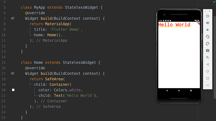
SafeArea widget example
Expanded
To tell Flutter that a widget within a Column / Row must take up all the remaining space you can use Expanded. With its flex property, you can control how much space the child widget should take up.
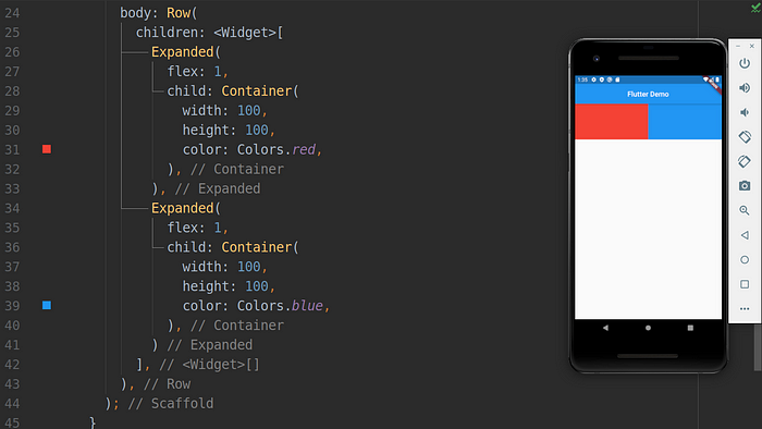
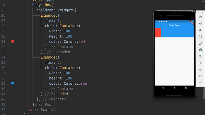
Expanded widget example
Wrap
One of the most feared errors in Flutter is the “overflow warning” or the “yellow line of the death”. This error happens when the content within a Column / Row exceeds the max size allowed. Wrap allows you to place widgets in a new line when they exceed the screen’s max size.
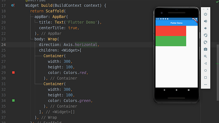
Wrap widget example
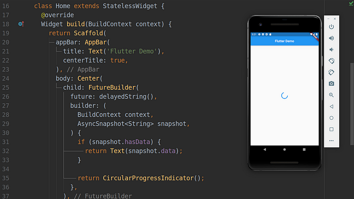
FutureBuilder / StreamBuilder
When you need to show a widget only after a Future (async operation in Dart) is resolved, well, FutureBuilder is what you need. The widget allows you to show a widget based on Future state:
- Success
- Fail
- InProgress
StreamBuilder is similar to FutureBuilder, the main difference is that: while FutureBuilder is used with a single async request, StreamBuilder is used to listen on a pull of streams.
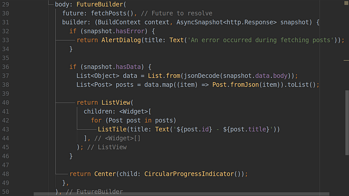
FutureBuilder widget example
FloatingActionButton
This widget is often used with the Scaffold widget to put a floating action button on the screen. You can also decide the position of the button with Scaffold’s property floatingActionButtonLocation.
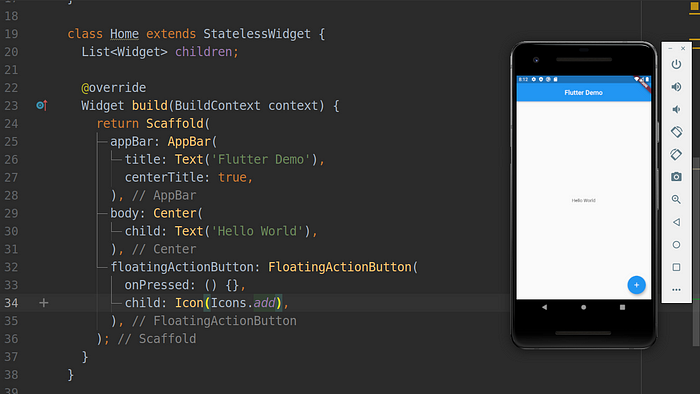
FloatingActionButton widget example
PageView
To create a scrollable list of pages you can use the PageView widget. You can also decide the scrolling orientation with the scroll direction property.
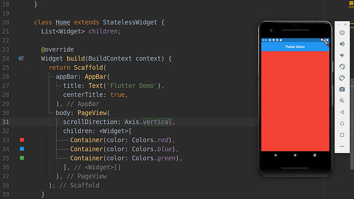
PageView widget example
SliverAppBar / SliverGrid / SliverList
These three widgets allow creating a custom scrollable experience respectively for an app bar, a grid, and a list. To create a custom scrollable behavior you should wrap these widgets within a CustomScrollView widget.
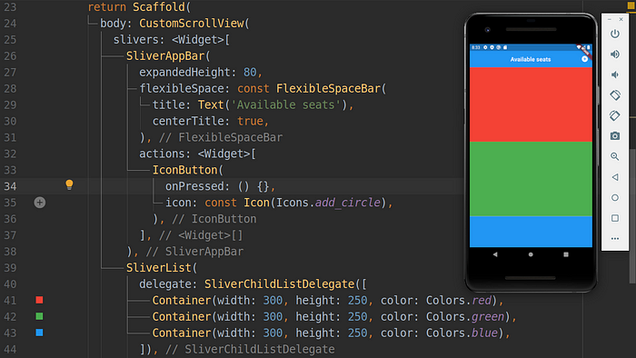
SliverAppBar / SliverGrid / SliverList widgets example
Hero
The Hero widget comes in handy when we need to apply animation on the change route. An old route disappears and a new route appears. This transition between routes can be animated through hero animation.
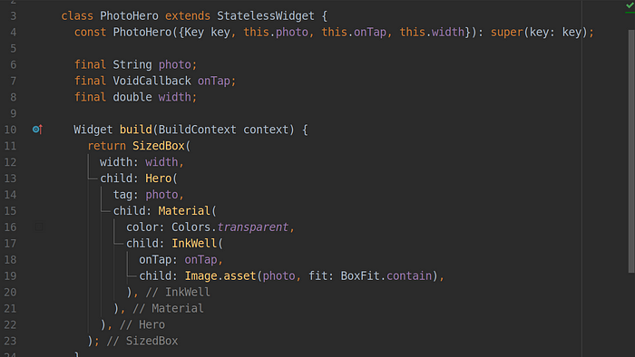
PhotoHero widget example
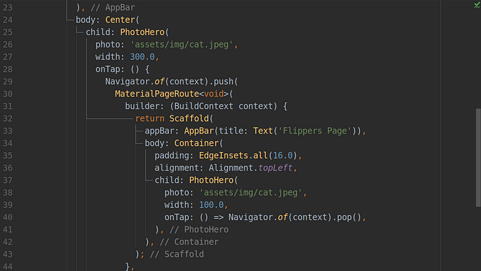
Hero animation example
Tooltip
Using this widget is very simple, but what I want to emphasize is the importance of this widget in terms of accessibility. Apps should pay attention to all users, breaking down barriers between people. Tooltip improves the accessibility of visual widgets by proving a textual representation of the widget, which, for example, can be vocalized by a screen reader.

Tooltip widget example
AbsorbPointer
Sometimes you need to disable pointer-events to an entire section of the screen. AbsorbPointer helps you to get this result. You can prevent pointer events by setting absorbing property to true.
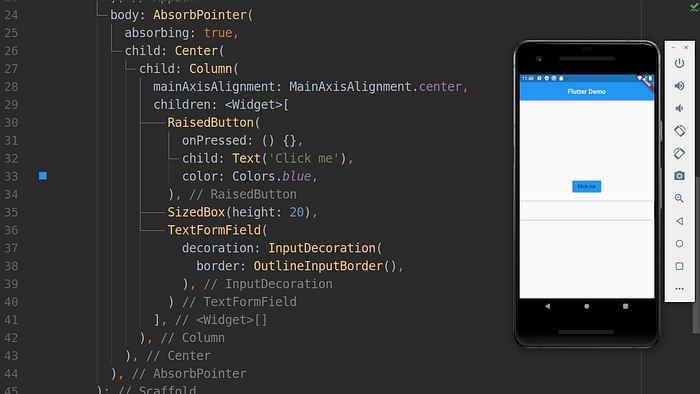
AbsorbPointer widget example
Stack
When you need to stack widgets and create a stack of elements, the Stack widget comes to your aid. By using the Positioned widget you can position elements within the stack. Its use is similar to the absolute value for the display CSS property.

Stack widget example
Dismissible
Do you want for your app acute effect to delete items from your ListView? Well, you need to use the Dismissible widget.

Dismissible widget example
SizedBox
The SizedBox widget is used when you need to create a box with a specific size (width/height). This widget allows specifying the dimension that a child element must-have. You can also specify an infinite dimension (double. infinite) if you want that child element to fill the entire size allowed. Another use of SizedBox is when you need some space between Column / Row elements.
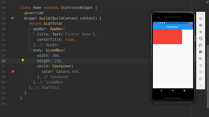
SizedBox widget example
Flexible
We have already talked about Expanded and its use within Row / Column widgets. Well, Flexible is very similar to it, the main difference is that Flexible allows you to control whether the child element should fill the entire space or not with its fit property, which could be tight if the element were to fill the entire space or lose if it were to take up only the necessary space.
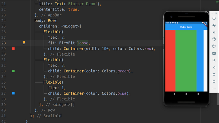
Flexible widget example
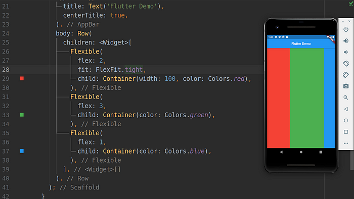
Flexible widget example
ListView / ListTile / CheckboxListTile
In Flutter, creating a list of scrollable items is very simple with the ListView widget. You can also control how items should be generated with the ListView.builder() named constructor. Often the list of scrollable items consists of a list of rows. In this scenario, you can use the ListTile widget within a ListView widget. little consists of a simple row where you can specify: a leading widget, a trailing widget, a title, a subtitle, a tap event, etc.
If you want to create a ListView of checkable items you can take a look at CheckboxListTile.
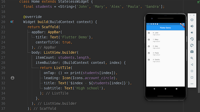
ListView example widget
ReorderableListView
This widget is very similar to the previous ones, the main difference is that with ReorderableListView you allow users to manually reorder list view items.
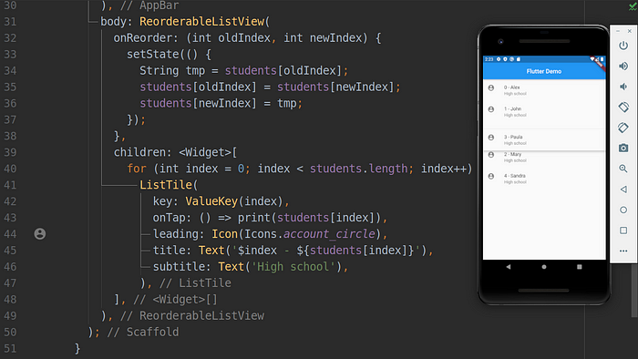
ReorderableListView widget example
DefaultTabController / TabBar / TabBarView
When you need to create a tab layout these three widgets will make your life easier.
- DefaultTabController is used to control the tabs within the screen
- TabBar is used to create the list of tabs to show on your app bar
- TabBarView allows specifying the content to show in each tab
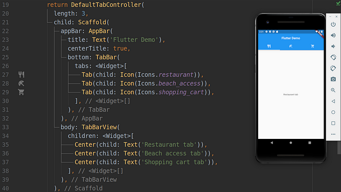
Tabs layout example
Drawer
In mobile apps is very common to have a sidebar for menu items navigation. The Drawer widget allows accomplishing such a scenario.
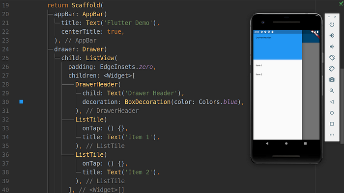
Drawer widget example
SnackBar
Sometimes you need to warn users about something. Use the SnackBar widget whenever you need it. Pay attention to context when you use SnackBar. If you pass Scaffold’s parent context instead of child’s context the SnackBar wouldn’t show up. In the example below I have used a Builder widget to pass the correct context.
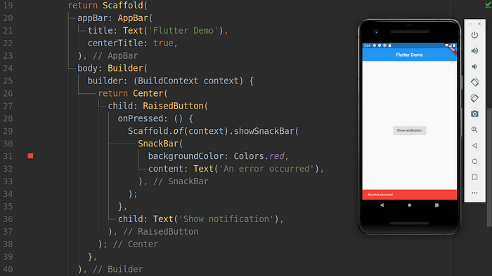
SnackBar widget example
CircularProgressIndicator / LinearProgressIndicator
During fetching data (e.g from an external API) we need to show up a progress indicator to the user. Flutter helps us with CircularProgressIndicator and LinearProgressIndicator. It’s also possible to specify if the progress bar should have a deterministic value or not.
CircularProgressIndicator widget example
Conclusion
As you could see, Flutter has a lot of widgets that you can use to customize your app. Knowing all of them is very helpful, but in this post, I have wanted to show you some of the beautiful widgets built-in with Flutter :)
If you want more info about Flutter’s widgets, check out these video series: https://youtu.be/yI-8QHpGIP4
Learn website development https://foozawebtech.com/talks
Subscribe to my youtube channel on YouTube